Case Study: Moxy
A frictionless tech ecosystem for a young hotel brand.
- Research
- Wireframes
- Visual Design
Our Brief & The Team
My team was assigned a project for bringing Marriott Hotels' new brand, Moxy, into the 21st century with a digital companion for the hotel experience. We were given a brief that stated the following:
Marriott is targeting Generation X and Millennials, the younger business travelers who might otherwise consider Marriott conventional and “uncool.” Moxy Hotel is ‘creating a stylish atmosphere where self-service means you can do what you want, when you want without holding you up’. Marriott’s research found Millennials gather in public to schmooze, work and drink. Marriott’s Innovation Lab is gearing up to offer hospitality features, content and social means for the guests in these communal spaces to easily connect.
I led a team of three UX designers to design a solution with a process grounded by rigorous research. We put together an ecosystem of products (app, kiosk, TV) that work together to make the hotel experience seamless and stress-free, but also scale up for users that want to add a little extra personality to their stay.
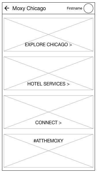
Final Product
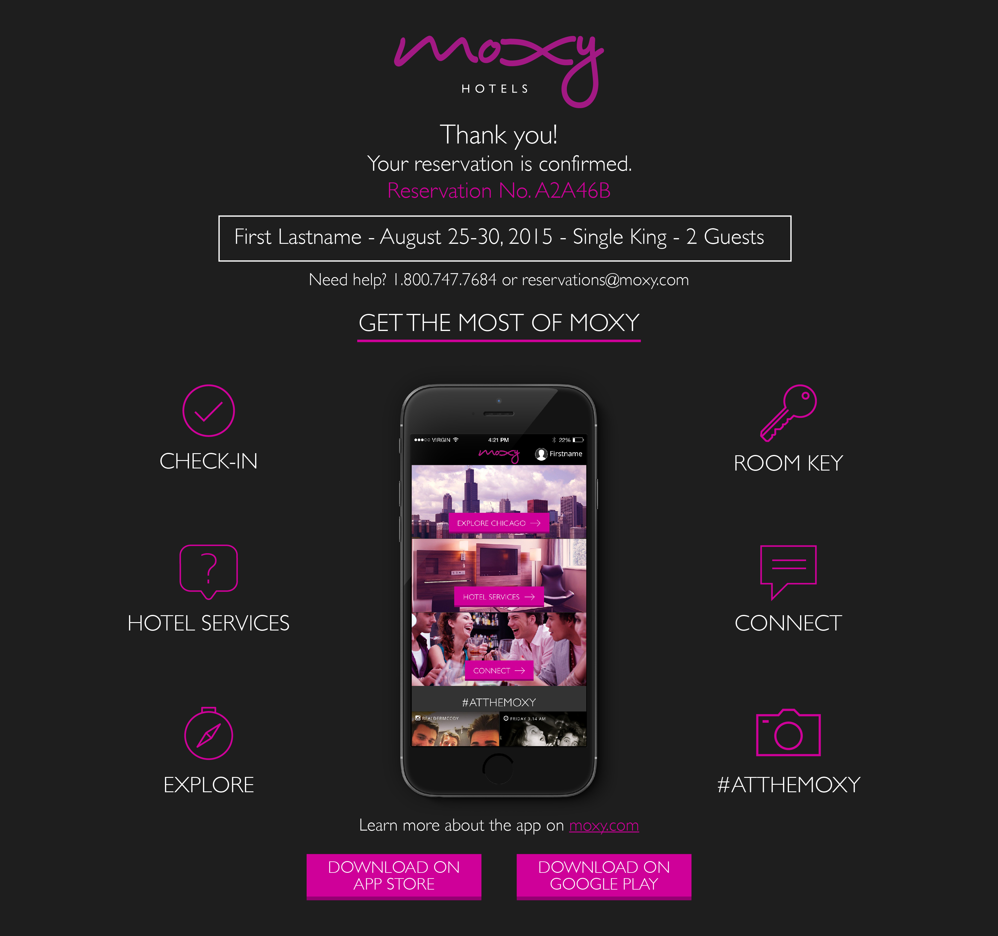
A reservation confirmation email guides users to the app.
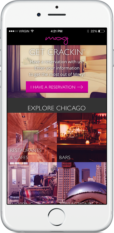
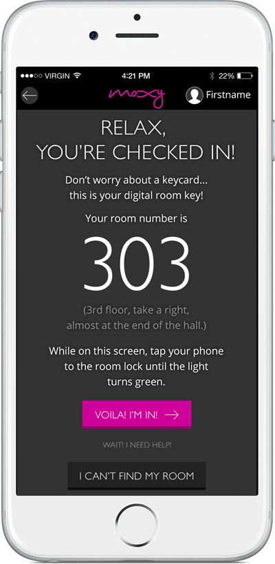
Users enter their confirmation info, check in, and receive a digital room key without ever having to speak to the front desk.
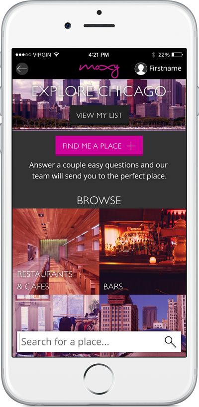
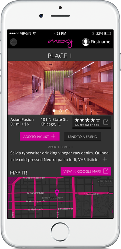
Users can find great suggestions of places to go in Chicago, view Yelp ratings, map their route, and add them to a personalized list.
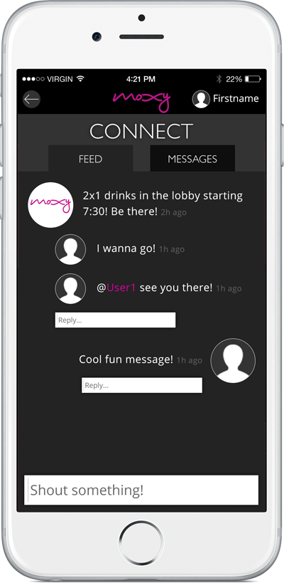
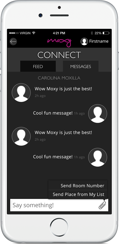
Users can see who else is online, connect with other guests, and send each other details & attachments.
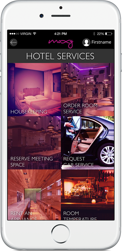
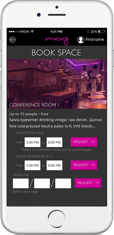
Users can use hotel services through the app - they can order room service, book meeting space, and change the temperature of their room AC unit.
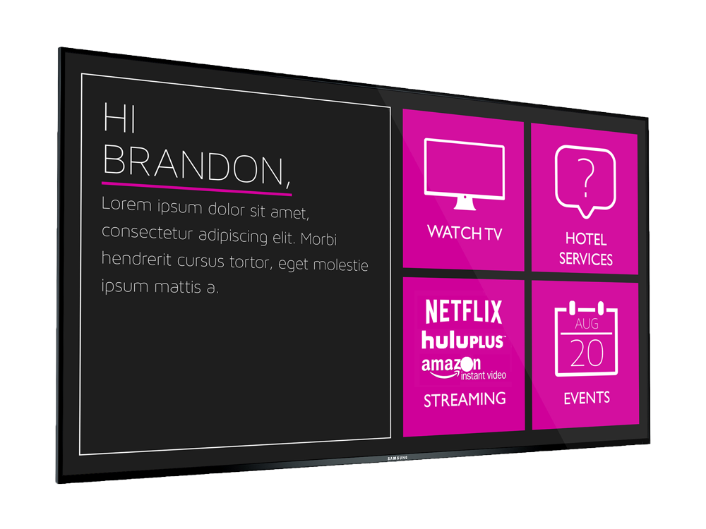
Each room's TV is equipped with the option to order hotel services and to connect the user's existing streaming video accounts.
Research
Competitive Analysis
We interviewed staff and guests and took in the atmosphere of several competing hotels in downtown Chicago. Two stood out to us in particular.
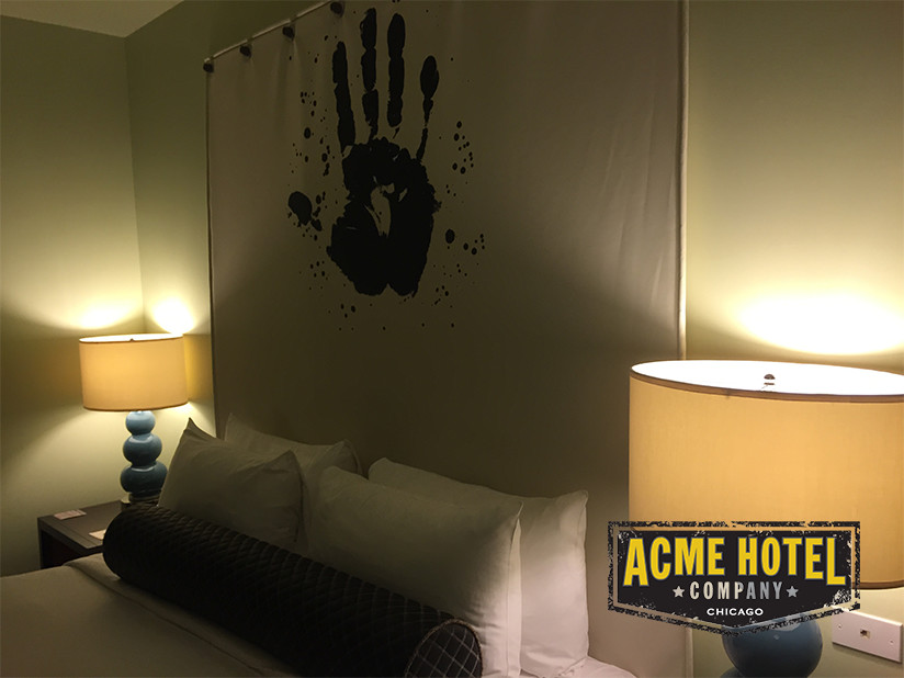
Acme Hotel
Low price point, pop-culture styling, down-to-earth staff, but not integrated with technology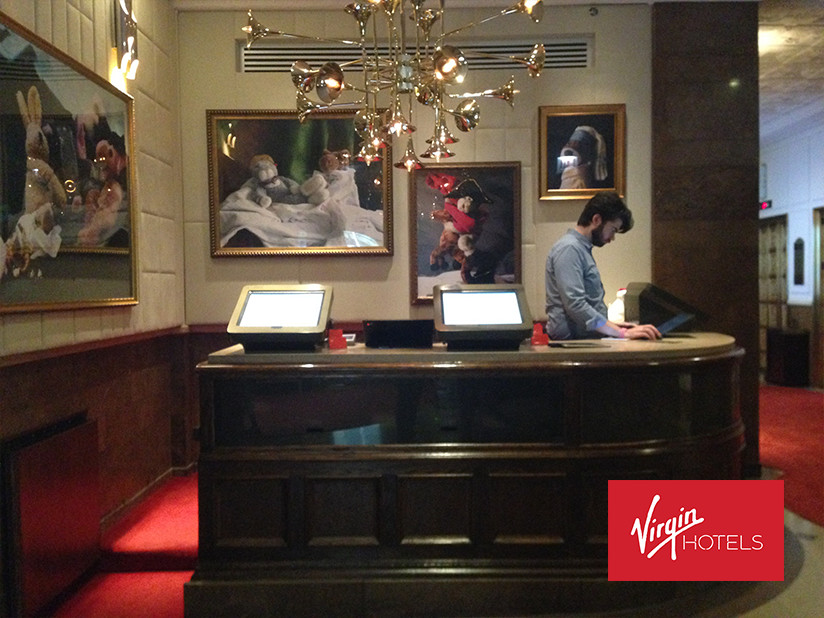
Virgin Hotel
The first of its kind, apps for staff messaging & guest services, but all the swanky tech comes at a high priceContextual Inquiry & User Interviews
We interviewed 14 people who travel for business in order to understand their needs, preferences and expectations. We uncovered a few common themes. Users wanted:
- efficiency
- consistency
- comfort
- flexibility
Persona Creation
We used the insights & data we gathered from our interviews to construct three personas:

Matt
Works in sales; meets with clients all day on business travel and just wants to unwind alone after a long day. Easy to please, but loves efficiency.
Carolina
Fashion blogger; travels with her team & needs communal space to meet with them during the day. Loves to find cool spots in every new city.
Brandon
Surveyor; travels with his team for long periods of time (sometimes a month). Wants lots of amenities, comfort, and to be reminded of home.We designed with these personas in mind, knowing the solution would have to accommodate users with these 3 different sets of goals.
Problem Statement
Marriott is attempting to target young business travelers by focusing on branding, vibe and design.
However, this is just window dressing: younger travelers really feel the hotel experience is inefficient, inconsistent, and doesn’t address their unique needs as individuals.
Design Direction
The solution should...
- be frictionless - not set up new barriers for use of existing services
- provide a consistent experience day-to-day and between hotels
- scale up to provide support for users who need it, but stay out of the way of those who don’t
- make the hotel experience simple and efficient
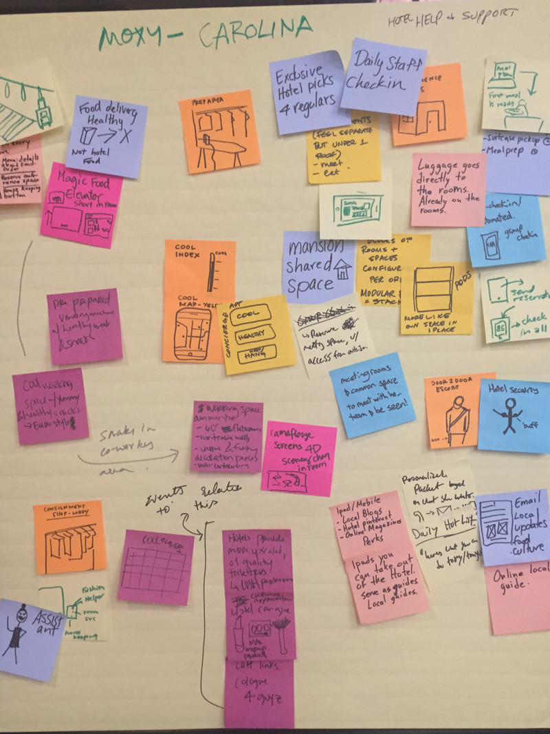
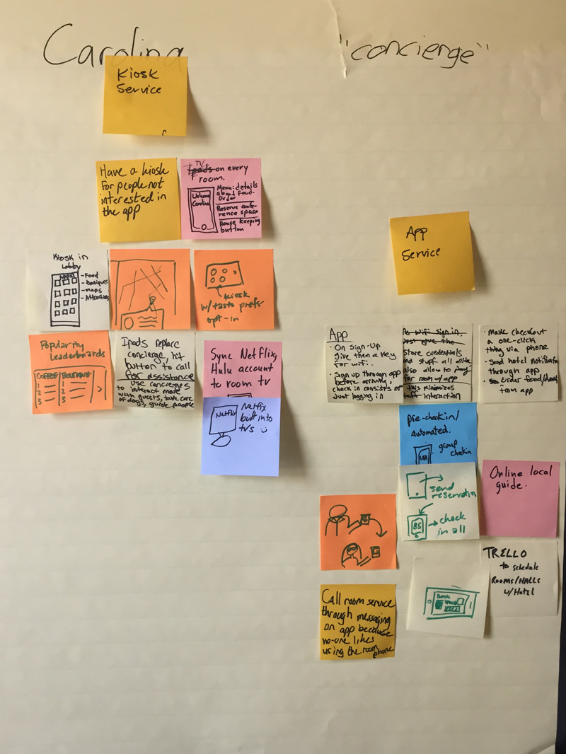
Design Studio
We asked a few participants to brainstorm rough ideas for features our personas would enjoy. Afterwards, we identified a few common trends among the ideas & decided which were within the project scope.
Wireframes
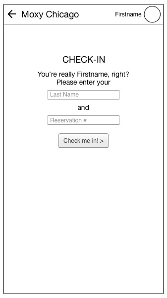
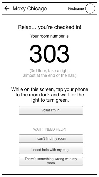
Checkin, digital room key and post-checkin homepage
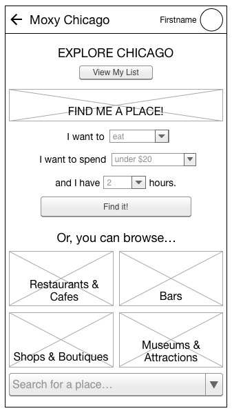
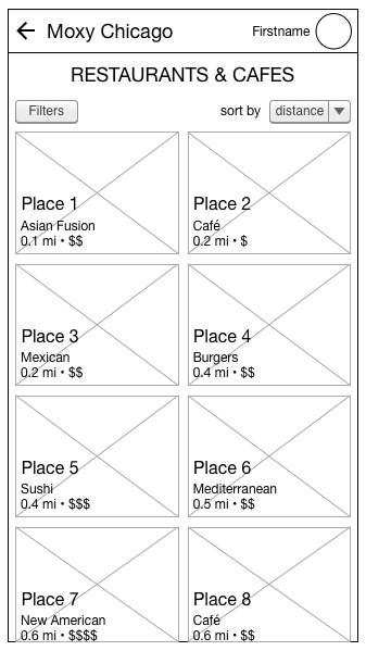
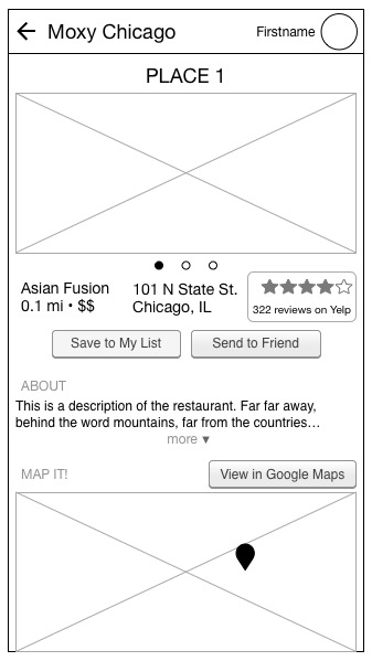
Explore attractions, get a recommendation, view details & reviews
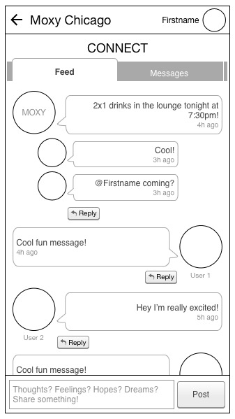
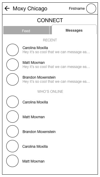
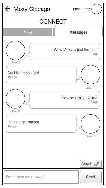
Twitter-style feed and direct guest messaging
Learnings
One important lesson from this project was the importance of research - without our user data, we might have missed the needs of Matt, who wasn't likely to use the social functions of the app but was very likely to want the convenience of its other services.
This led us to the concept of scalability. Throughout the process, we made sure the service didn't put off any potential users by asking for too much information & input.
Like what you see? Contact me and let's work together!